React Bootstrap Modal Popup Example
- Published on
- Jigar Patel--3 min read
Overview
- Introduction
- Installation
- Importing Bootstrap CSS
- Creating the Modal Popup
- Output
- Source Code
- About the Author
- We're Hiring
- Related Blogs

Introduction
n this tutorial, we will learn how to create a modal popup in a React application using Bootstrap. We'll take you through the process step by step.
If you haven't checked how to create a React app yet, you can find a guide on this link: 'REACTJS.' It's important to learn the basics before you start.
Overview: In this tutorial, we'll implement a modal popup in a React application using Bootstrap. We'll guide you through the process of installing the necessary packages and creating the modal step by step.
Installation
To get started, you'll need to install Bootstrap using the following npm command:
npm install react-bootstrap bootstrap
Importing Bootstrap CSS
After successfully installing Bootstrap, you should import the Bootstrap CSS in your src/index.js file like this:
import 'bootstrap/dist/css/bootstrap.css';
Creating the Modal Popup
In your src/App.js file, we will write code to create a simple Bootstrap 4 modal popup using the react-bootstrap library. Here's the code:
import React, { useState } from 'react';
import { Button, Modal } from 'react-bootstrap';

function App() {
  const [show, setShow] = useState(false);
  const handleClose = () => setShow(false);
  const handleShow = () => setShow(true);

  return (
    <div className="container">
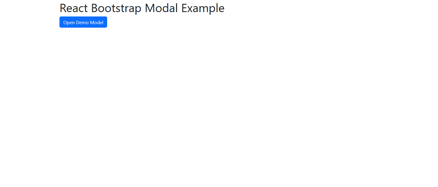
      <h1>React Bootstrap Modal Example</h1>
      <Button variant="primary" onClick={handleShow}>
        Open Demo Model
      </Button>
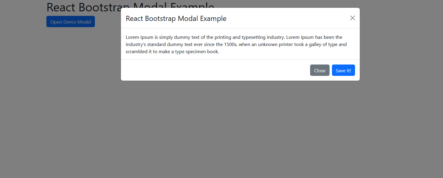
      <Modal size="lg" show={show} onHide={handleClose}>
        <Modal.Header closeButton>
          <Modal.Title>React Bootstrap Modal Example</Modal.Title>
        </Modal.Header>
        <Modal.Body>
          Lorem Ipsum is simply dummy text of the printing and typesetting
          industry. Lorem Ipsum has been the industry's standard dummy text ever
          since the 1500s, when an unknown printer took a galley of type and
          scrambled it to make a type specimen book.
        </Modal.Body>
        <Modal.Footer>
          <Button variant="secondary" onClick={handleClose}>
            Close
          </Button>
          <Button variant="primary" onClick={handleClose}>
            Save It!
          </Button>
        </Modal.Footer>
      </Modal>
    </div>
  );
}

export default App;
Running the Example: To see the modal in action, you can run your React application using the following command:
npm start
Output
Running any of these commands will create a folder called my-app in your current directory. It contains the initial project structure and installs necessary dependencies. No need for complex configurations – you'll have everything you need.


That's it! You've now created a modal popup in your React application using Bootstrap.
Source Code
The complete source code for this tutorial is available on GitHub. You can find it Here.
About the Author
Jigar Patel is a React.js enthusiast and a software developer at JBCodeapp Company. Visit our JBCodeapp to learn more about our work in the React.js ecosystem.
We're Hiring
Are you passionate about React.js development? We're always on the lookout for talented developers to join our team. Check out our careers page for current job openings.